BRIEF
To create the brand logo, image and guidelines for a social enterprise creating travel itineraries, for those seeking impactful travel.
CONCEPT
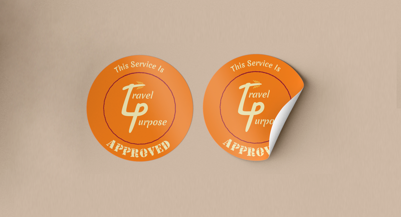
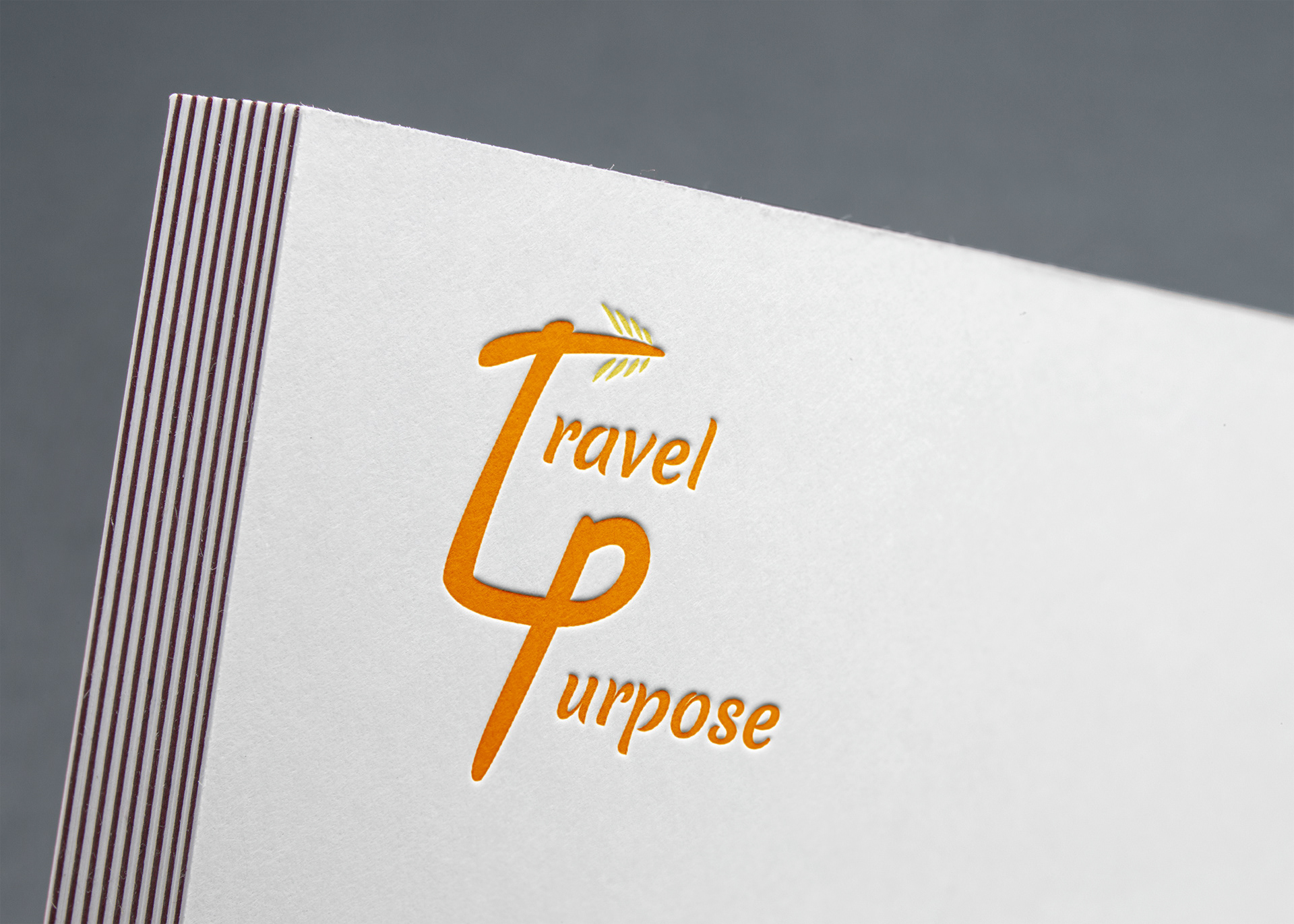
To incorporate the business abbreviation (T4P) with a positive and forward motion of taking their client on the next forward-thinking journey.
The palm leaf is significant to the T4P's home base, Kenya. The colours orange and yellow are for happiness, positivity and change.
EXECUTION
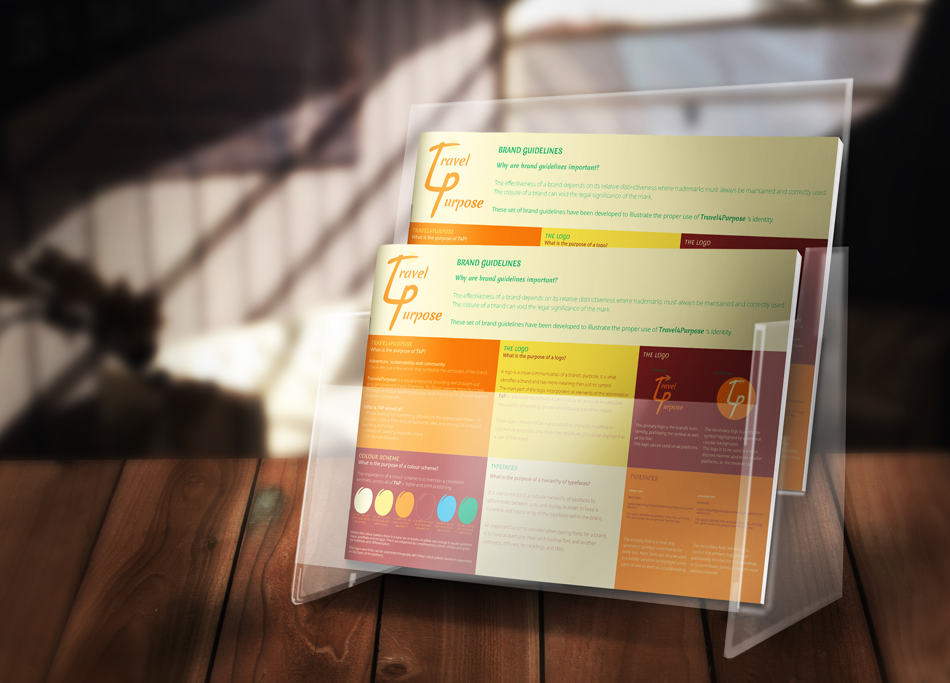
The logo was made in Illustrator and the brand guidelines in InDesign.
SKILLS
Branding, colour theory, client communication, concept development & layout